Grailed Filters
Improving the buyer’s filtering experience on Grailed, a peer-to-peer marketplace.
OVERVIEW
Grailed is the world's largest marketplace for men’s fashion and streetwear.
The goal of this project was to solve the problem of new and existing buyers not engaging with filters on the app.
Grailed is the world's largest marketplace for men’s fashion and streetwear.
The goal of this project was to solve the problem of new and existing buyers not engaging with filters on the app.
ROLE & DURATION
Lead Product Designer
User Research
Interaction
Visual design
Prototyping
Usability Testing
May - June 2019
Lead Product Designer
User Research
Interaction
Visual design
Prototyping
Usability Testing
May - June 2019
The Problem
Grailed’s iOS app was experiencing over 2,500 unique new user sign-ups per day. We knew that on web the majority of new users who made a purchase had applied at least one filter after searching. However, on iOS, the majority of new users were not engaging with filters and or converting as fast as our web users, leading us to identify user problems with the iOS filtering experience.
The User Research
A 1-day onsite usability test and interview was conducted with the 3 new iOS users and 3 existing iOS buyers. My research encompassed -
• Observing how a buyer would find an item they’re willing to purchase
• Identifiying problem areas and expections of the current experience
• Debriefing questions about shopping habits and behavior


EQUIPMENT
One camera to record emotions and body language. One IPEVO V4K camera to record tap and swipe interaction, and phone in hand placement.
The Findings

- Once accessing a feed of listings, users wanted to refine the results to only show items in their size orprice range. Most did not notice the filter ribbon at the top, and
- Most didn’t notice you can swipe horizontally on the filter ribbon to access size, price, and all other filter options as they are shown out of view.
- After applying a filter, users did not always know or remember their applied selections.
- Most users did not notice a difference between the category and size filter screens as the UI was near identical.
- Some users thought filter options disappeared due to the constant change of positioning when using horizontal swipe.
- Users did not know the result count after filters have been applied
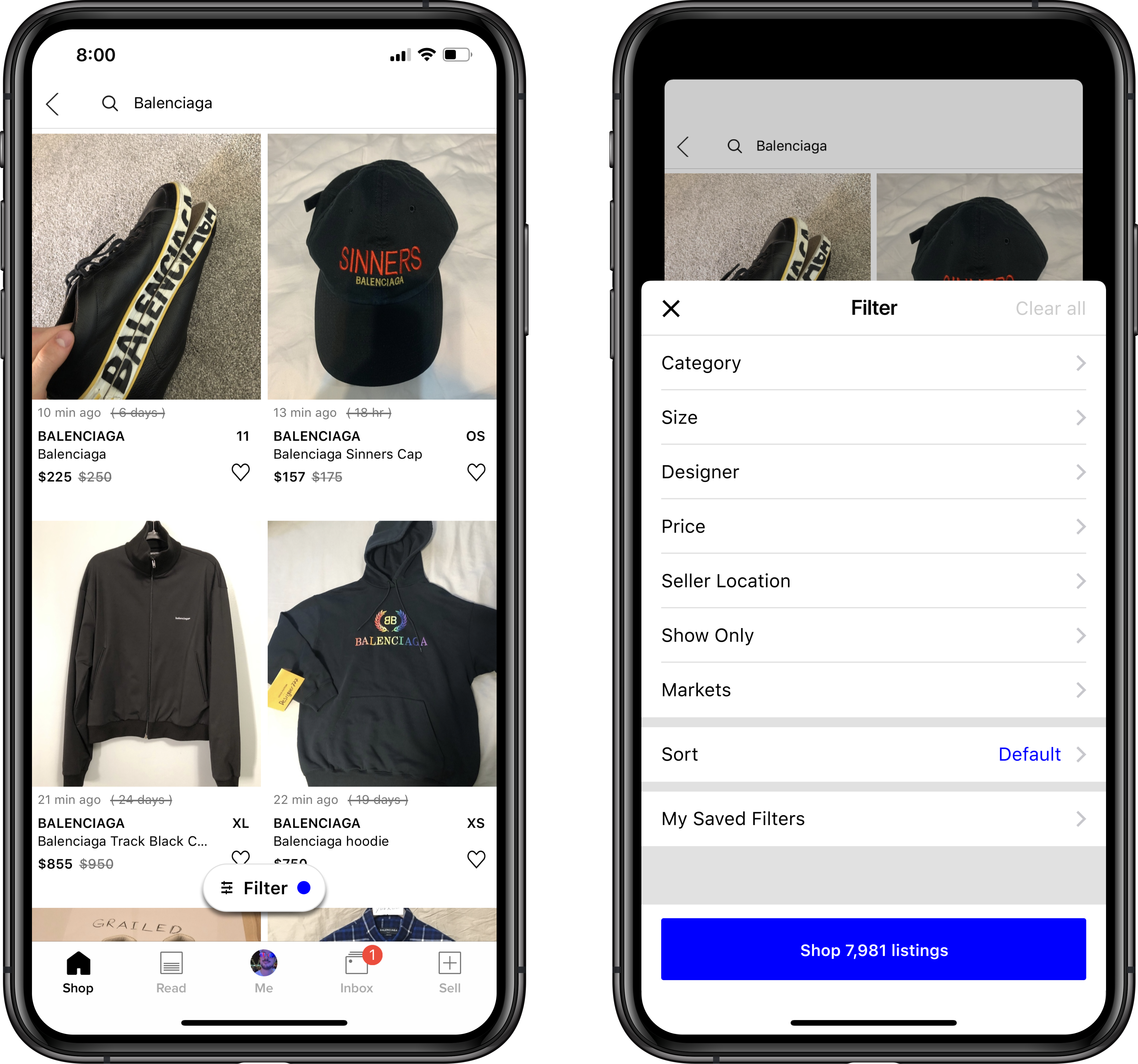
Ideation
How might we improve a buyer’s filters experience?
- Remove the filter ribbon functionality
- Add a new floating filter action button, always persistant and doesn’t scroll away
- Reorder all fitler options by expectation and most used
- Highlight applied selections in a clear way
- New size filter interface to seperate from category filters
- Only show size options for categories users have selected

Exploration

Final Wireframes
Validation & Experimentation
The Results
-
20% increase in new user conversion on iOS
-
increase in filter engagment across al users
Next Steps
User mentioned they would like more filters, such as:-
Color
-
Season/Year
-
Seller rating
-
On Sale
-
Ship to location