Grailed Search 2018

Overview
In 2018, we researched how users interacted with Grailed and learned that most buyers preferred to search rather than browsing, using filters, and or engaging with editorial content. We ran some experiments and ended up altering search in our header navigation and later our hero block with value proposition messaging on our homepage, providing users with a better search and discovery experience, driving a significant increase in search usage and since prompted us to offer more search features and integrations with Algolia.
Problems
Desktop
- The search icon with text matched the style of other header links, making it easy to overlook. When clicked the page would scroll you down to the feed section of the homepage activating large scroll bar under editorial content.
- We realized this jumping behavior was not ideal or easy for users to comprehend. Users would mostly scroll down to the feed, skipping the search button in the header or immediately scroll passed editorial content to search.
iOS
- To search, users had to click on a small icon positioned in the top left corner, sometimes lost and not seen, the icon then opened a new screen allowing users to search.


Solutions
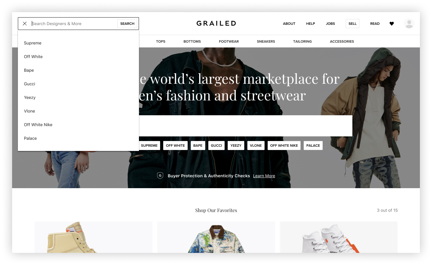
- Restructure and reorganize desktop header
- Provide focus on a newly styled search bar
- Provide a fixed header on desktop and mobile web
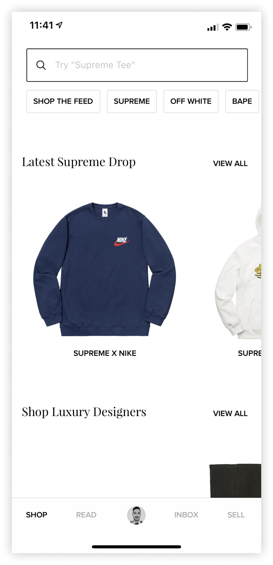
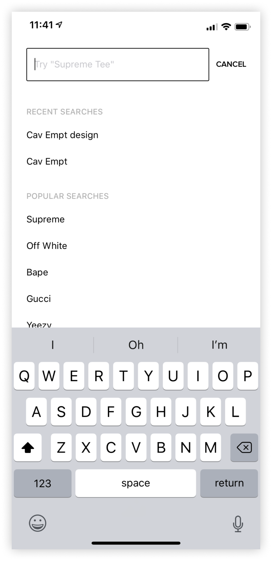
- Add and improve placeholder text
- Later include popular and recent search terms
- Add search suggestions through an Algoia integration
- New search result pages, separate from homepage feed
- Add a new more search bar to the iOS Homepage, with popular search term quick links
New Header

New Search Dropdown with Algolia

New iOS
Team
Product Designer (Me)
Product Manager
Lead iOS Engineer
Full Stack Engineer
Product Designer (Me)
Product Manager
Lead iOS Engineer
Full Stack Engineer
Deliverables
Wireframes
High Fidelity Mocks
Prototypes
Wireframes
High Fidelity Mocks
Prototypes
Tools
Whimsical
Figma
Invision
Whimsical
Figma
Invision